CSS grid for a long list
Twelve projects, two columns, and a hairline between rows. Grid does the work that would otherwise be markup.
A list of projects is a list. Once the entries pass six or seven, one column of full width rows becomes a long scroll and the year column drifts far away from the name it belongs to. A two column grid fixes both, and it does not need extra markup.

The layout
Each entry is an article with two children: the text and a small definition list holding the year and the stack. Grid places them side by side and keeps the ledger aligned across every row.
.project-list {
  border-top: 1px solid var(--border);
}

.project {
  display: grid;
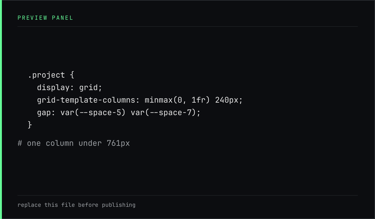
  grid-template-columns: minmax(0, 1fr) 240px;
  gap: var(--space-5) var(--space-7);
  padding: var(--space-5) 0;
  border-bottom: 1px solid var(--border);
}

.project-body {
  min-width: 0;
}
minmax(0, 1fr) is the part worth remembering. A plain 1fr refuses to shrink
below its content, so one long URL or one long word makes the whole column
overflow. Setting the minimum to zero lets the text wrap instead.
One column underneath
Below 761px the grid becomes a single column and the label and value pair stays horizontal, because a narrow screen has no room for a second column of metadata.
@media (max-width: 760px) {
  .project {
    grid-template-columns: minmax(0, 1fr);
    gap: var(--space-3);
  }
}
minmax(0, 1fr) keeps the text column from refusing to shrink, and the second
row of the grid holds the ledger once there is no room beside it.
Why not cards
Cards were the obvious alternative: a box around each project, a shadow, a hover. They also turn twelve entries into twelve competing objects, and every border announces itself. A single hairline between rows groups the list without giving each item a frame.
The page is a document with a ledger, not a board of tiles.
What to check
- A long project name wraps instead of pushing the ledger off screen.
- A stack line with many items wraps inside its column.
- The last row has a border, so the list ends with a line rather than a gap.
- At 380px wide there is no horizontal scrollbar.