A dark theme with one accent
Black background, one green, and a short type scale. The constraint does most of the design work.
The palette is deliberately small. A black page, a near white for text, a grey for secondary text, and one bright green for links, dates, and small labels.
The colours
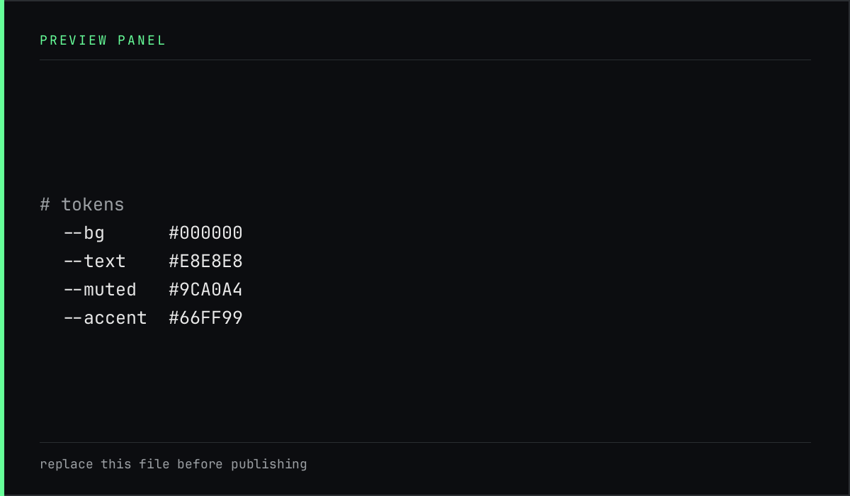
| Token | Value | Used for |
|---|---|---|
| background | #000000 |
the page |
| text | #E6E6E6 |
body copy |
| muted | #9A9A9A |
secondary copy |
| accent | #66FF99 |
dates, labels, hover |
Every text pair is checked before it is used. The muted grey is the closest to the line, and it still clears the contrast minimum on black.
Why no second accent
A second colour would compete with the first. With one accent, the eye learns quickly what green means: this is a link, this is a date, this is the current page. That is more useful than a richer palette.
One accent is a vocabulary. Two accents are a debate the reader has to settle on every page.
Motion
Only four things move: the page header on load, a short rule beside a section index, the underline under a nav link, and link colour on hover. Each one answers a question about state, and all of them stop when the reader asks for reduced motion.